Wednesday, February 12, 2014

Valentine Handkerchiefs

Here are Valentines handkerchiefs from my collection.

The middle 20th c was quite nostalgic. You see a lot of hoop skirt/top hat couples.


                                This is a great example of handkerchief design in its hey-day.


 Machine embroidered handkerchiefs were cheap gifts in the later 20th c.


And a small quilt hanging I made based on a vintage Valentine card and using handkerchiefs in the border. The pattern is available at my etsy shop Rosemont Needle Arts.


Sunday, February 2, 2014

Happy Ground Hog Day. And the Robins Return to Michigan


The sky is grey but bright, a Michigan version of sunshine.

The snow is so deep, our driveway is like one of those bobsled runs. The mail box is nearly unreachable.
The road has narrowed because of the snow piled on either side, so we can just manage to back out and turn the car. This is what it looked like last week...


Today we had a flock of Robins visiting the neighborhood! Amazing! 17 degrees, two feet of snow on the ground, so barren even the deer have not come to feast on our bushes.
 
But the Robins decided to return to Michigan.


The village has been quiet. Empty houses surround us, summer occupied cabins left empty for six or nine months of the year. 

 
And the snow is pristine white, unsullied by car exhaust. There are few businesses open in town: the post office, bank, two bars, and a coffee house. This is a resort town, a place for summer cottages and filled marinas and camp grounds. The village may have 1500 people in the summertime, with four ice cream spots. In winter there are perhaps 500 hardy folk who either like ice fishing and winter sports or don't have a winter retreat elsewhere. Even the pizza parlor closes come November. 
 
So I hope the Robins know what they are doing, and that spring will be here sooner than another six weeks. The deep snow and empty houses and icy roads and overcast sky have made us all just want to hibernate.


Saturday, February 1, 2014

Downsizing Means Quilts Must Go

In a little over a year my husband will retire and we will leave off parsonage living and settle into our retirement home. I inherited my family home, a 1969 ranch, and we have been fixing it up for several years. It is much smaller than the housing we have lived in. SO we have to be very thoughtful about what we can keep.

Which means I have had to carefully consider which of my many quilts I can keep and which must find new homes. I have been quiltmaking since 1991 and over the years had to try many new techniques and patterns, resulting in small quilts. I have given away or donated a hundred quilts over the years. But my closet is still full.

Today I listed quilts on my etsy store, Rosemont Needle Arts. There are quite a few handkerchief quilt wall hangings. I started collecting hankies in 1993 and have 800 in my collection.


Radiant Orchid is the Pantene color of the year, and it appears in this mid-century handkerchief. It is machine quilted.


A 1940s pin-up girl hanky is featured in Lady Eve, surrounded by vintage clothes choices. The hand quilting patterns are traditional Japanese Shashiko.


I later used the vintage handkerchiefs in a different way, bringing the motifs out into the borders. This 1970s handkerchief is surrounded by borders and appliqued sunflowers, and embellished with silk flowers, buttons and a bumblebee pin.

 
One of my earliest finds, and most favorite handkerchief, is this mid-century linen hanky with Franz List's Liebestraume, which I learned to play on the piano as a girl. I used some vintage fabrics in the piecing and for the backing.
 
 
This old hanky pictures Indian head pennies! I used 1930s reproduction fabric. It is hand quilted.
 
50s Christmas handkerchiefs and a pattern from Sharon Newman's book Handkerchief Quilts were often on my table during Holiday season. It is hand quilted.
 
I also have listed some original quilts such as my Barbie Portraits. The third in a series of Barbie quilts I made, this one is young and fun.


My Morning Glory Flower Fairy image was from a 1920s book which I blogged about a few weeks ago. It uses crayon tinting, embroidery, silk flowers, beading, and has a sheet net overlay, all on silk fabric.


 There are even more quilts listed for sale. I am ready to let these children go as a part of moving on to the next stage of my life.
 

Monday, January 27, 2014

Design Essentials for Good Costume: Line. 1943 Advice from Grace Morton

Grace offers basic art theory in her book The Arts of Costume and Personal Appearance. Her chapter on design essentials starts by offering a basic lesson on art terms, with Line considered most important to costume.
  •  Straight lines, as found in tailored clothes, Mission furniture, and modern skyscrapers


  • Full, round curves as pictured below and as found in Rococo art


  • Restrained curves, as in curling smoke, the curve of a flower stem, Chinese paintings, and "the undulating lines of a picture hat."


Additionally, lines produce movement.

Vertical lines are found in Gothic sculptures, or in pleated skirts or striped shirts.

Horizontal and vertical lines appear in the aprons worn in this 1962 ad

Horizontal lines appear in flounced skirts, the wide off-the-shoulder necklines of the Romantic period, and in horizontal striped shirts.

Diagonal line movement is found in surplice closings as in the picture below.


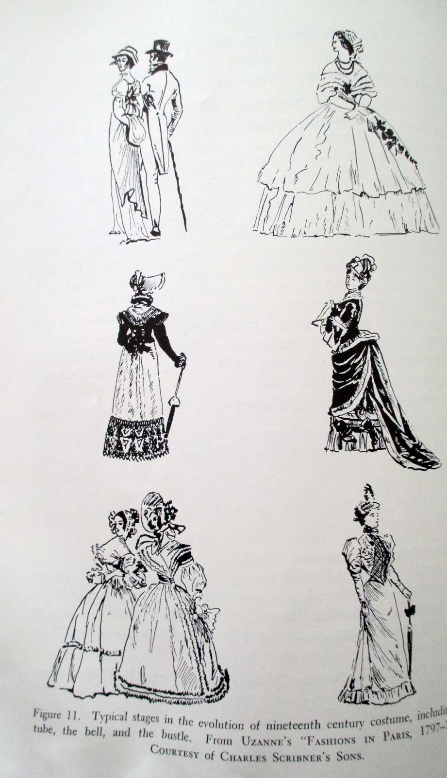
The silhouette is noticed first, especially from a distance. It changes with the modes, and with seasons, and over the years. The dress worn during Jane Austen's time was basically tubular. The Victorian dress was bell shaped. The bustle brought in an "S" shape.
 
 
A 1943 "tubular" silhouette
 

 "One of the most important requirements of all art is that it conform to the law of unity with variety, or variety within unity. The silhouette must be judged by this law." The silhouette should be related to body structure, hide imperfections, and emphasize good points. The hoop skirt, bustles, and mutton sleeve did not fall under this stricture.

19th c "bell" shaped skirt had little to do with anatomy. It did make the waist look smaller.
 
The 1943 era dress below conforms to the standard put forth by Grace.


Maggy Rouff evening gown, courtesy of Harper's Bazaar, "Perfection in this geranium pink pleated crepe dinner gown, flowing gracefully with body lines and emphasizing points of body articulation. It satisfies the modern demand for elimination of every unnecessary detail and for a silhouette neither too revealing nor concealing."
  
"A beautiful dress will reveal some parts of the anatomy, while others be subtly concealed with graceful drapery or fullness."

The outline should be interesting, and in character with the spirits of the times. Grace notes that in the 1940s a return to femininity was revealing smaller waists, curved bosoms, and graceful flowing skirts. The severity of tailored suits should be softened as in the suit below with its sleeves gathered at the wrists, waistline definition, and contrasting dickey.


The full, round shapes of the Botticelli inspired gown below is constrained by the embroidered bands. 
 
Designed by Jessie Franklin Turner. Metropolitan Museum of Art.


Rhythm in costume can be found in the draping of fabric in the colors or prints of the fabrics, embellishments, and it line.
Vivian Leigh as Lady Hamilton. Courtesy of United Artists Corporation. white crepe with sequin embroidery is a gown of classic inspiration, where a beautiful rhythm is achieved by skillful cutting and shaping.

Allowing certain lines dominance holds the viewer's attention.

 
The beautifully curved waistline and the graceful flowing skirt with its pointed inserts are subordinated to the greater interest of the bodice top and interestingly designed sleeve's.
 
 
An afternoon coat in which a dominant horizontal rhythm is given stability by a vertical movement. The shapes themselves have significance, but with relationship to the whole.
 
 
Next time I will offer advice from the chapter The Art of Combining Colors.

Sunday, January 26, 2014

The Arts of Costume and Personal Appearance--Criteria for Judgling Prints

Grace Margaret Morton considers the understanding of value as basic to choosing prints. This is something every quilter understands: value is often more important than color. "Watercolor quilts" are based on this concept; one arranges prints based on value, from light to dark. Print fabrics with high value contrast have to be handled thoughtfully in a quilt as they can really stand out.


Nolan is the Japanese term for using light and dark masses creatively to achieve harmony in tonal relations, Grace explains. And good costume analysis takes into consideration dark-light contrast. Here is the author's guide to judging prints:

1. The shapes or motifs should be interesting in contour and arranged in a pleasing rhythm to give balance (see figure 8, upper left sample above)
2. When more than one motif is used, they should be harmonious in shape and size (see figure 9, upper right sample above)
3. The negative space of the background areas should have interest in itself (see figure 10, lower left above)
4. Pictorial or realistic images are never suitable for wearing apparel. Good prints may have naturalistic motifs, but there should be something original, smart, or exotic (see figure 11, lower right above)


5. The effect of design as a whole when viewed from a distance through half-closed eyes should give a satisfying impression, with no part appearing to jump out as in the fabric in figure 12, upper left above.

Allover prints may be poor in design because the motifs are unrelated, as those in figure 13, upper right fabric in photo above. The flowers have nothing in common with the plaid. Bad arrangement of patterns will lack movement or rhythm, and spottiness of lights and darks also contribute to problem prints.

Characteristics of prints include:
Scale. The horse and buggy of  figure 15, lower left in the picture above, is a small scale print. Below is a large scale print, which Grace suggests could be used by "larger" women or more sophisticated women.


Widely vs. compactly spaced motifs (figures 9 vs. 17)
Strong contrast in value vs. close value (figures 11 vs. 17)
Strong or intense vs. soft and grayed colors
Abstract or geometric motifs vs. naturalistic motifs (figures 17 vs. 18)
Conventional vs. exotic
Formal vs. informal or exotic character


Forceful (see Stehli wine and gray silk plaid below) vs. dainty small prints


The print on top below is "dainty." The "amusing" Mexican hats and original plaid at the bottom of the picture should be worn only by the young, 


 The print below by Christian Berard has orange Victorian motifs on rusty black crepe and are suitable for afternoon or "personal mood".
Below: The violet-blue crepe with formal motifs in black and white "suggests street wear for mature women."

 
I wish the photos were in color! Imagine blue-violet with white and  black. Yummy.

Next post I will share from the chapter "Design Essentials for Good Costume."